
It might seem easy to make a nursing poster; however, it’s not really. It takes planning to create a poster that’s eye catching, informative and professional. A poster can make an impression, whether it’s for a classroom group project, conference, research or a seminar at the hospital. Lots of nursing students and health care professionals find it difficult to organise information, visuals, colours, and layout in a suitable way. No wonder nurses can benefit from learning practical graphics Design Tips for Nurses.
A nursing poster should be attractive and informative, and should also be a page turner. Posters are frequently used in academic and health care environments to convey research results, patient care plans, case studies, and public health awareness. The more effective your design, the easier it will be for viewers to quickly grasp your message.
In this guide, we will explore what makes a successful nursing poster, layout ideas, font types to use, colour schemes to consider, and top graphics Design Tips for Nurses
Why Nursing Posters Matter
A nursing poster is more than text and images stuck on a board. It’s a means of expressing information visually. Posters enable the dissemination of knowledge in a simple and engaging way in hospitals, universities and medical conferences.
Using a professional nursing poster presentation, students and health care employees can:
- Share research findings
- Explain healthcare procedures
- Provide education to patients and communities.
- Present evidence based practices
- Improve communication skills
- Build academic confidence
Get Professionally Designed Nursing Poster at Affordable Prices
Expert team of designers at Nursing Assignment Writers UK helps students in creating informative and engaging nursing posters for A-1 Grades!

A bad poster can be a distraction or not be of much use in conveying key information. In contrast, a neat and symmetrical poster draws people’s eyes and enhances comprehension.
Graphic Design Tips for Nurses
To create a nursing poster, you do not need to be a professional graphic designer. You do not need to know a ton of rules to make it more readable and appealing to look at.
So, here are some key graphics Design Tips for Nurses:
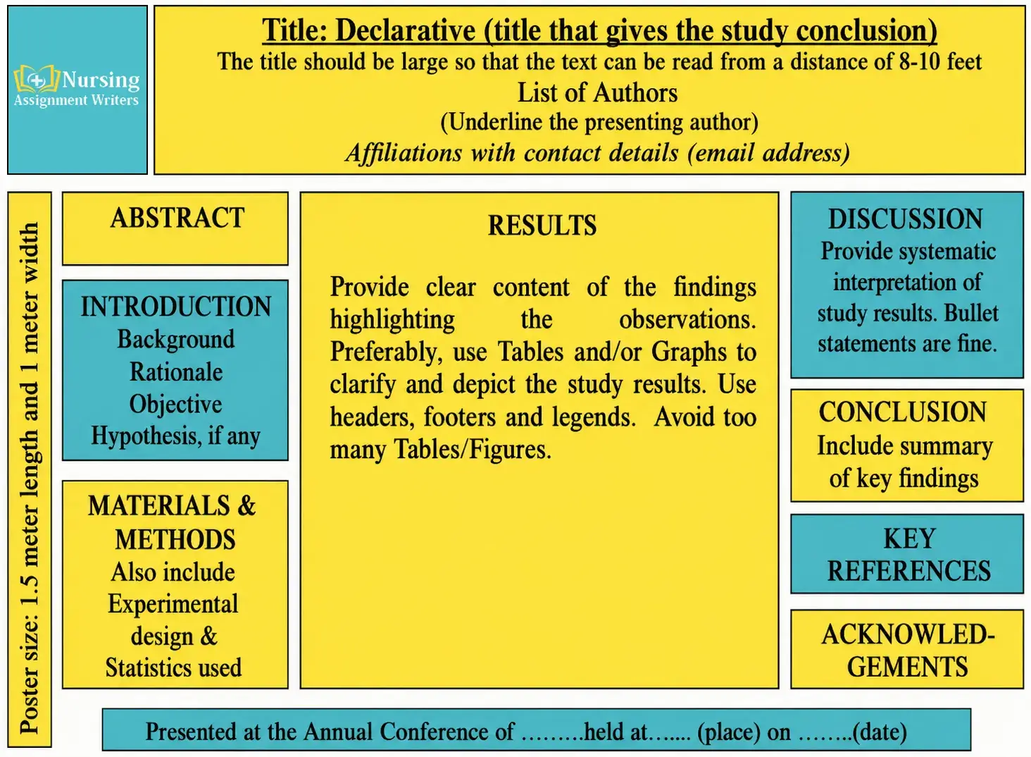
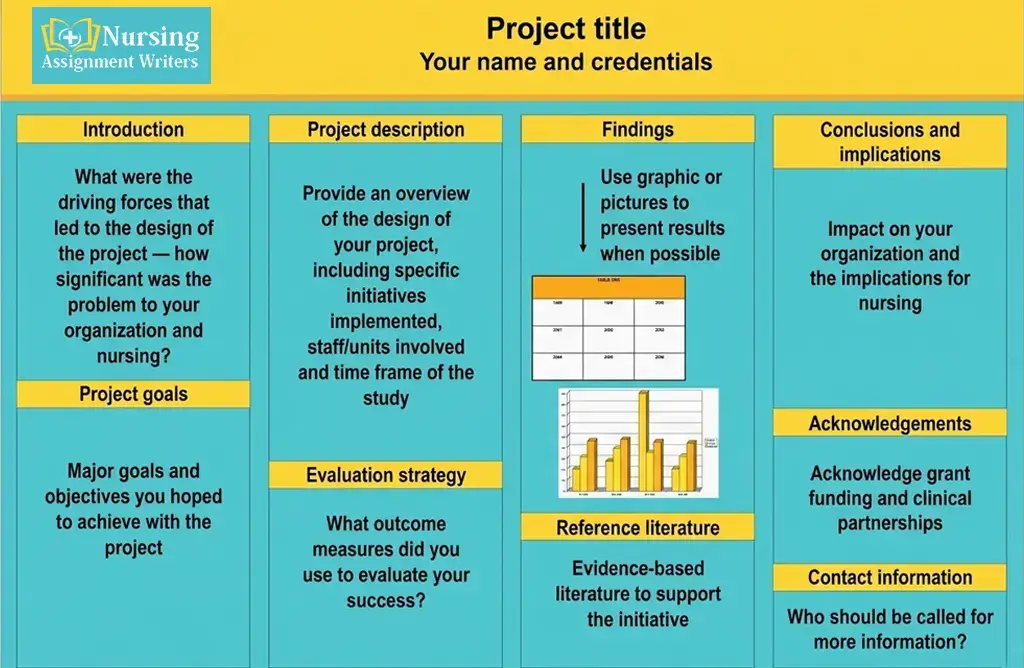
Maintain a simple and Organized Layout
Simplicity is one of the most crucial principles of poster design. Limit text and images on your poster to a maximum of 200 words and images.
The following elements should be included in a clean layout:
- A clear title
- Introduction section
- Main content
- Findings or discussion
- Conclusion
- References
Organise sections to be presented logically to the viewer, from top to bottom or left to right.
White space is also important. Empty spaces are useful to make the poster easy to read and to avoid a messy poster.
Choose Readable Fonts
Many students use fancy and decorative fonts, which are hard to read from a distance. Always use professional and clean fonts such as:
- Arial
- Calibri
- Helvetica
- Verdana
The title is to be large and bold to attract attention. Headings should be prominent and legible from several feet away; body text should be easy to read from several feet away.
Recommended font sizes:
- Title: 72–100 pt
- Headings: 36–44 pt
- Body text: 24–32 pt
One of the best poster tips and tricks is readable typography, since it is a key factor in engagement with the audience.
Use Colours Carefully
When used appropriately, colours can make a significant contribution to your poster. But too many bright colours can be distracting to viewers.
Here are some basic colour guidelines:
- Apply 2 to 3 primary colours – these are the ones that are most basic.
- Opt for neutral and business like hues
- Use a high contrast background and text.
- Avoid neon colors
- Use medical tones, such as blue, green, or white, to communicate with health care workers.
Most of the time, dark text is easy to read on a light background.
Add High Quality Visuals
It is one of the best graphics Design Tips for Nurses. Images, charts, icons and graphs provide information in a quick and simple way. Graphs, charts and other visual elements are particularly effective for communicating healthcare statistics or research results.
Effective visuals can be:
- Infographics
- Medical diagrams
- Pie charts
- Bar graphs
- Patient care flowcharts
- Icons related to healthcare
Do not use blurry or low quality pictures as they diminish the professionalism.
When poster making about nursing, visuals should be in support of the message, not overwhelming.
Focus on Key Information
A frequent student error is adding large paragraphs of text. Most people only spend a few minutes viewing a poster.
Rather than going into great detail:
- Use bullet points
- Write short sentences
- Highlight keywords
- Keep information concise
Your poster should summarise information—not explain all of the details.
Maintain Proper Alignment
When things are aligned, there is structure and balance within a design. If the text and images are not aligned, the posters will not be professional. Make sure to follow this graphics Design Tips for Nurses.
Make sure:
- All headings are aligned correctly.
- Margins are equal
- Images are evenly spaced
- The text boxes are aligned uniformly
Easily keep things aligned by using grid systems in PowerPoint or Canva.
Include Accurate References
In academic nursing posters, there are many needs for references in research and information based on evidence.
Keep references:
- Short and properly formatted
- In a smaller text size
- At the bottom of the poster
Cite as per your institution style guide (APA, Harvard, etc.).
Best Practices for Poster Design in Nursing
In the presentation or evaluation, knowing the best practices for poster design may help your work be noticed.
Start with a Clear Objective
When creating your poster, consider the following questions:
- What is the purpose of the main idea?
- To whom is the text addressed?
- What do viewers need to know?
All of your information and images should communicate one core message. Do not include extraneous details.
Use a Strong Title
The title is the first thing that viewers see. A weak title will not draw in.
The title should be strong and should be:
- Short
- Informative
- Easy to understand
- Relevant to the topic
For example:
- “Improving Patient Safety Through Hand Hygiene”
- “Discroll Model of Reflection”
- “Educating on the Reduction of Medication Errors in Clinical Settings”
Balance Text and Visuals
A good nursing poster should have a balance of text and graphics.
A general rule is:
- 40% text
- 40% visuals
- 20% white space
This will make the read easier and hold the audience attention.
Use Consistent Design Elements
Your poster will appear polished and professional when it is consistent.
Ensure consistency in:
- Font style
- Font colors
- Heading sizes
- Image style
- Spacing
Your poster may be confusing if you make random design changes.
Proofread Everything
Poor spelling and grammar will diminish trustworthiness. Be sure to read through your poster before printing it or presenting it.
You may want to get feedback from other students, mentors or colleagues.
Things to check:
- Typing errors
- Incorrect medical terms
- Data accuracy
- Alignment issues
- Image quality
Nursing posters are important requirements of academia in the UK. Whether you are studying in the expensive or cheapest nursing university.
Selecting the Perfect Nurse Poster Size Options
Choosing the right size options for nurse posters is another essential.
The size of the poster may depend on:
- University requirements
- Conference guidelines
- Printing budget
- Presentation location
There are a variety of nursing poster sizes, such as:
| Poster Size | Purpose |
|---|---|
| 24 x 36 inches | Classroom presentations |
| 36 x 48 inches | Research conferences |
| A1 Size | Academic displays |
| A0 Size | Professional healthcare conferences |
Event instructions must be checked before designing the layout – resizing may alter image quality and layout.
Nursing Assignment Design Tips
A good nursing assignment research design is a blend of academic quality and visual communication.
Here are a few tips that can be used:
Use Templates Wisely
Professional poster templates can be found on platforms such as Canva, PowerPoint, or Adobe Express. Templates save time and provide structure.
Just do not duplicate designs, however. Customise them according to your topic and audience.
Keep Branding Professional
If your institution/hospital has guidelines for branding, adhere to them strictly.
Use:
- Official logos
- Approved color schemes
- If necessary, use institutional fonts.
This will help give a more professional look.
Practice Your Presentation
If your poster contains an oral explanation, practice your presentation.
Prepare to explain:
- Your research purpose
- Key findings
- Recommendations
- Clinical significance
Design quality is equally significant as confidence and communication skills.
Conclusion
Creating an effective nursing poster is not as simple as tossing some text and pictures together. Effective posters are clear, organised, professional, and creative. These graphic design tips for nurses can help you design a stunning and informative presentation that will grab the audience attention and make your message come across.
Whether it is font and colour choices, content structure, or the appropriate use of visuals, every element is crucial. Whether you are creating a classroom project, conference display or a healthcare awareness campaign, it can make a huge difference if you have the basics of best practices for poster design.
Above all, keep it simple and easy to read. A clean and well structured poster will always have a greater impact than an overcrowded poster. Your next nursing poster presentation can be really special with some planning, confidence, and creativity.
FAQs
1. What are some of the most relevant graphic design tips for nurses?
The key guidelines are: Font readability, Clean layout, Professional colours, and Concise information.
2. What is the best software to use for creating a nursing poster?
Canva and Microsoft PowerPoint are popular options as they are easy for beginners and also provide professional templates.
3. How big should a nursing poster be?
For better readability, use the following font sizes for titles (72 100 pt), headings (36 44 pt), and body text (24 32 pt).
4. What should a nursing poster have in it?
Key points should be summarised briefly on a poster. Keep paragraphs short and avoid using long paragraphs at all costs.
5. What are some of the typical sizes for nurse posters?
Most popular sizes are 24×36, 36×48, A1 and A0 as per presentation needs.
6. Why do visuals have a role in nursing posters?
Visuals enhance understanding, hold attention and facilitate the explanation of complex health information.
7. What are ways to enhance nursing assignment design?
Pay attention to alignment, readability, consistent formatting and balance between visuals and text.
8. What colour is best for nursing posters?
Professional hues such as blue, green, white and grey are used frequently due to their calming and clean look.